This concept rendering embodies the rich cultural tapestry and vibrant history of Historic Filipinotown in Los Angeles, offering a visual narrative that honors the community's legacy and its future aspirations. As a pivotal piece of urban revitalization, this design was conceived through a meticulous process of exploration, collaboration, and refinement, reflecting the essence of a neighborhood steeped in heritage and resilience.
Each element of the rendering; from the dynamic use of color to the symbolic architectural motifs, was carefully chosen to resonate with the Filipino-American community's spirit and contributions to the city's fabric. The design process involved several iterations, developed in close consultation with community leaders, stakeholders, and city officials, ensuring that the final concept not only captured the neighborhood's essence but also met the rigorous criteria for urban development and public art in Los Angeles.
The approved concept is more than a mere architectural proposition; it's a beacon of cultural pride and a cornerstone for future generations to recognize and celebrate the rich history of Historic Filipinotown. This project underscores the power of design to forge connections, celebrate diversity, and create meaningful spaces in our urban landscapes.
At South Coast Lighting & Design, I contributed to the West Hollywood AIDS Memorial project; a powerful tribute to the resilience and memory of those affected by the AIDS epidemic. While the concept and initial design came from the project’s lead creatives, my role focused on developing custom renderings for our bid and presentation.
Using advanced digital tools, I created lifelike visuals that conveyed the emotional depth and architectural intent of the memorial. These renderings helped communicate the project’s significance to stakeholders and the community, translating its vision into an accessible and moving presentation.
The process required sensitivity; each detail, from lighting and materiality to the balance between built and natural elements, was considered to reflect the memorial’s themes of remembrance, healing, and hope.
Working closely with the design team and internal collaborators, we aimed to produce visuals that honored the lives commemorated by the memorial. These renderings became a key part of our proposal, supporting our shared goal of creating a lasting and meaningful space in West Hollywood.
This project was a reminder of how design can shape emotion, memory, and social connection; it was an honor to help bring that vision to life.
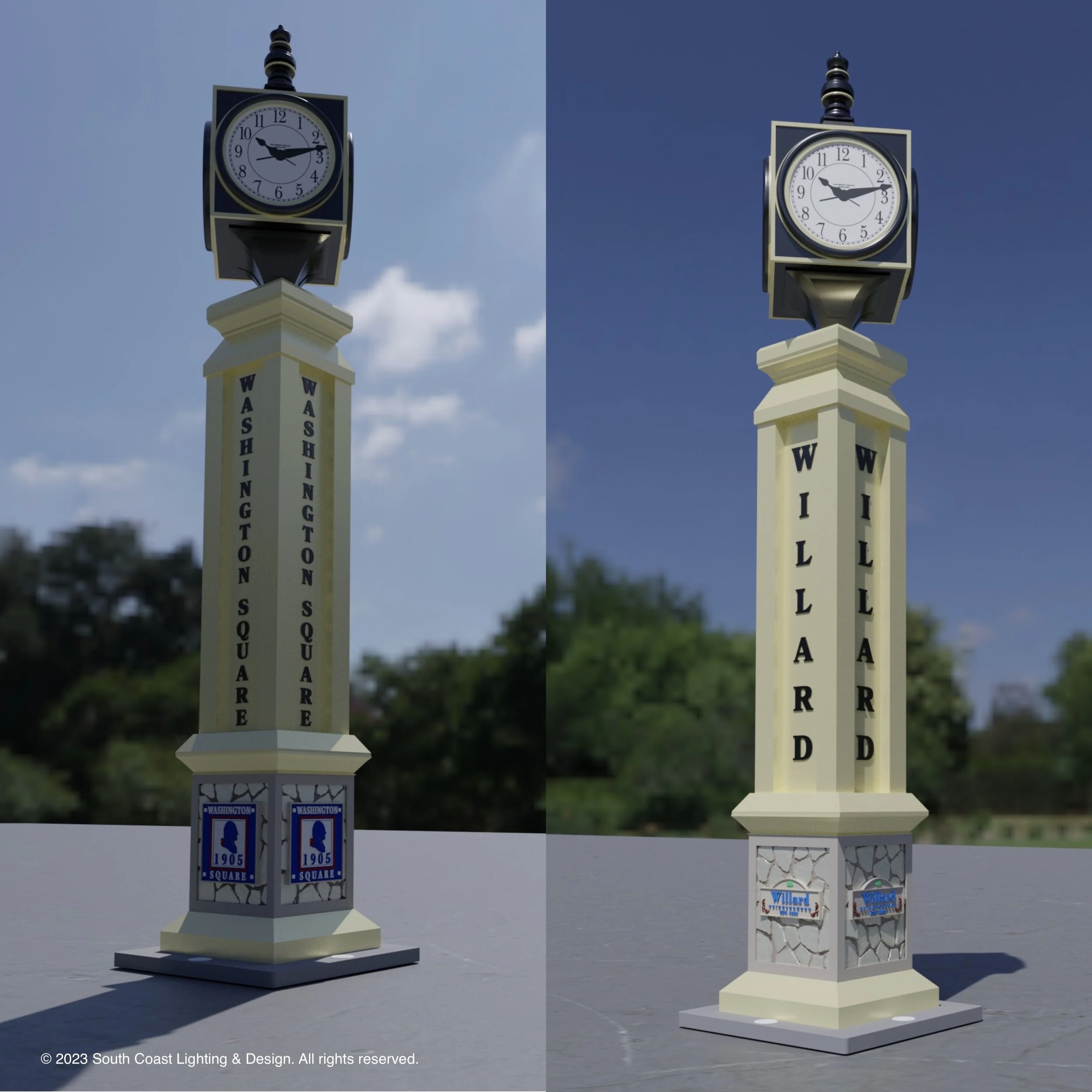
This custom clock tower was designed to serve as a prominent marker between Washington Square and Willard Street in Santa Ana. I developed the entire concept independently, from initial design through 3D rendering and final installation.
After presenting the proposal to the city and stakeholders, the design was approved and secured the project for our team. The clock features bold vertical lettering, tiled base panels, and a clean, civic-minded aesthetic to complement the surrounding community. My rendering helped communicate the vision clearly and played a key role in earning the city’s support.
This project exemplifies my ability to take an idea from concept to reality with full creative and technical ownership.
Located in the heart of Los Angeles, the Maya Corridor is a landmark project celebrating the heritage of the Maya community through urban design. At South Coast Lighting & Design, I created detailed 3D renderings to help bring this vision to life.
Using Shapr3D and Blender, I designed large-scale glyphs inspired by ancient Maya script, blending historical accuracy with a contemporary sculptural feel. Each glyph was digitally molded on my iPad, refined in Blender, and prepared in Aspire for CNC machining in HDU board, ensuring visual impact and durability.
These renderings were instrumental in gaining city approval and helped visualize how the 80-foot gateway would serve as both an entryway and cultural statement. The project was more than technical execution; it was a collaborative tribute to Maya legacy and its presence in LA’s evolving story.
This corridor represents both the city’s cultural richness and a proud milestone in my design career.
This conceptual gateway was designed to reflect Temecula’s wine heritage through a timeless, European-inspired aesthetic. Featuring Corinthian-style columns topped with illuminated globes, the archway blends classical influence with regional character.
Textured finishes, grapevine motifs, and weathered patinas were used to echo the valley’s rustic charm and celebrate its viticultural identity. Though South Coast Lighting & Design provided only the design package, the concept was embraced by the city as a symbolic landmark for the region.
My role included full creative development and 3D visualization, helping secure city approval and setting the stage for future implementation.
Located at the southern edge of San Diego County, this monument was designed in partnership with Caltrans as a visual marker of California’s southern gateway. I led the design process and secured agency approvals, balancing cultural symbolism with regulatory requirements.
The monument features a prominent California bear at its base and a vertical silhouette of the state. A sunburst and star emblem nod to California’s identity and optimism, while the phrase “Bienvenidos a California” offers a bilingual welcome that reflects the community’s cross-border roots.
This project involved detailed collaboration with Caltrans to ensure the design met visibility, safety, and durability standards. The result is a landmark that anchors San Ysidro’s role as both a point of entry and a community with deep local pride.
This entry monument was designed to honor pioneering aviator Jacqueline Cochran, whose legacy as a record-setting pilot continues to inspire the region. The project began with research into Cochran’s contributions to aviation, which informed the design language and historical context of the sign.
Bold raised lettering sits against a backdrop inspired by the surrounding desert and sky, with a jet silhouette nodding to Cochran’s influence on modern aviation. The materials and colors were selected for both durability and regional relevance.
Rather than just marking an entry point, this sign was developed to serve as a visual tribute; recognizable, functional, and rooted in the area's aviation history.
With a flair for capturing the essence of a brand in a single, compelling visual narrative, I have carved a niche in the design of magazine ads that resonate with national audiences. My work has graced the pages of esteemed publications such as Landscape Architect, MedTech, and 24x7 Magazine, showcasing an ability to engage readers and leave a lasting impression.
My approach to ad design is deeply rooted in an understanding of diverse industries, from the verdant creativity required for Landscape Architect to the innovation-centric themes for MedTech, and the precision-driven demands of 24x7 Magazine. This industry-specific knowledge allows me to tailor each ad to not only meet but exceed the expectations of a discerning readership.
The journey of each ad from concept to publication is a collaborative endeavor. I work closely with marketing teams, editors, and clients to ensure that every design aligns with the publication's ethos and the advertiser's branding goals. The result is an ad that not only stands out in the visual landscape of magazine content but also aligns seamlessly with the narrative flow of the publication.
My designs are more than advertisements; they are visual stories told through carefully chosen images, typography, and color palettes that capture and convey the core message of the brand. My ads are crafted to not only draw the eye but also to inspire action, whether that's brand recall, lead generation, or direct sales.
The success of my ads is reflected in their reach and the recognition they have garnered, serving as a testament to the power of thoughtful, well-executed ad design in the world of print media.
I specialize in crafting product catalogs that artfully balance aesthetics with functionality, ensuring that each page invites engagement and clarity. My approach to catalog design revolves around an intuitive layout that makes navigation effortless, allowing customers to find the information they need with ease.
With an eye for design and a deep understanding of marketing dynamics, I create catalogs that are not just visually appealing but also strategically organized. I prioritize clean, attractive layouts, high-quality images, and clear, concise descriptions that together enhance the customer experience. My designs reflect the brand's identity and resonate with the target audience, leading to a cohesive and compelling narrative from cover to cover.
In every catalog I design, I pay meticulous attention to the details that matter. From typography that complements the visual elements to the careful selection of color schemes that reflect the brand palette, every decision is made to ensure a seamless blend of information and design. My goal is to create a tactile experience that feels as good to browse as it is informative.
Understanding that the user's experience is paramount, I approach catalog design with a focus on easy-to-read layouts and logical progression. This user-centric approach means considering the flow of information, the placement of call-to-action elements, and the overall journey a reader takes through the pages. The result is a catalog that not only showcases products but also serves as an effective sales tool.
Creating a logo is not just about crafting an image; it’s about weaving the essence of a brand into a single emblem. With a keen eye for design and a pulse on the latest trends, I specialize in developing logos that capture the unique identity of each company I work with.
My logo design process is a blend of creativity and strategy. I begin by delving into the brand's core values, target audience, and industry position to ensure the logo not only stands out visually but also communicates the right message. Whether it's a startup looking for a fresh face or an established brand needing a revitalized image, I bring the same level of dedication and detail to every project.
I pride myself on versatility, producing logos that range from minimalist and modern to rich and classic. Each design is carefully tailored to meet the needs of the brand, ensuring that it resonates with the intended audience and stands the test of time. My logos are more than just attractive graphics; they are strategic business tools that help companies establish their presence in a competitive market.
I believe in a collaborative approach, working closely with clients to refine concepts and bring a shared vision to life. Through an iterative process, I ensure that the final logo not only meets but exceeds expectations, providing a solid foundation for the brand's visual identity.